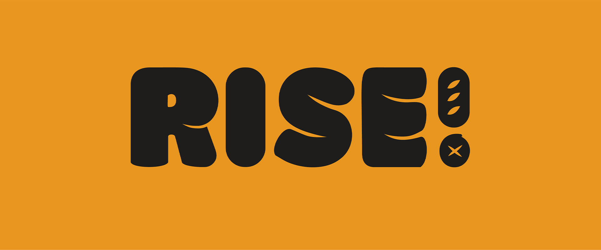
Rise! Restaurant Branding
Fresh baked breads are hard to come by in the selection of convenient and fast breakfasts.
What if there was a fast, casual, to-go breakfast restaurant that served freshly baked breads, pastries, sandwiches, bowls, and more?
Ditch the frozen breakfast sandwiches. Choose Rise!
The Project
I designed a 17 page branding deck for the fast-food bakery "Rise!" — I considered the details of a brand story, logo, colors, typography, tone of voice, imagery, and mockups.
View PDF or click on the images below to expand to full screen.
Client
SUNY New Paltz Coursework
Deliverables
Branding, Deck Presentation, Packaging, UI, Social


Process
Starting this project, I brainstormed and sketched a variety of logos and names that could potentially be used for my fast-food bakery restaurant. I narrowed down my favorites to a list of 8.
When choosing which logo mark I wanted to pursue, I considered the location, assisting visuals, and other qualities that would influence the experience of this store. I thought the big, bold, puffy typography of #8 resembled a clean take on puffy rising bread. I did not want to pursue something sophisticated, as that would emulate a more of a sit-down experience.
The Rise! experience is quick, friendly, and straight to the point.


Visual Exploration & Type Design
Bringing my ideas into Illustrator led me to experiment with different typefaces and color palettes. I drew color inspiration from the images I collected during my visual exploration stage. After sifting through typefaces, I realized that I could not use a pre-existing typeface to meet the needs of my vision. I then decided to pursue a custom type for the logo.

Reflection & Takeaways
If I would expand this project, I would like to explore stronger visuals (experimentation with different shapes and patterns) that could make the brand feel more unique and identifiable. I also am curious about how the assets could be used for in-store signage/interior design, which would help capture a more holistic experience of the branding in-use.
My work process for this project was far from usual. I worked on this with a much quicker pace than I usually experience with design projects. I designed the entire brand deck and all of the content within the deck (apart from the logo and UI screens) in 1 day.
To me, working on this project was like a 24-hour branding design challenge. I still see a lot of creative potential for the designs I've created, but I learned from this project how to design and produce final deliverables with a quick turnaround.